In an ERP system, actual numbers are usually preferred. However, there are times when the information is better presented in a graphical format. Microsoft Dynamics NAV 2013 has a number of graphs that are available within the Role Tailored Client, but most users don’t realize they can create additional graphs.
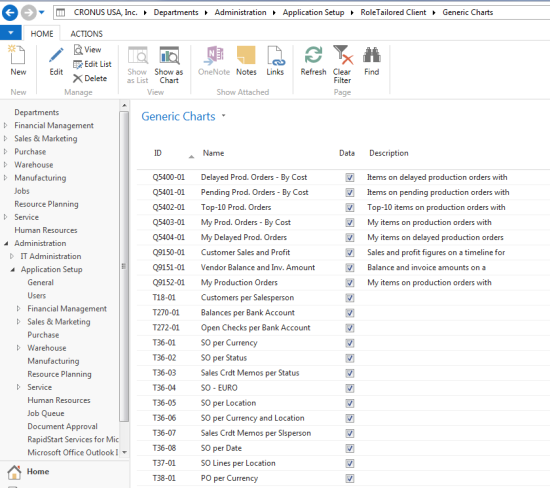
In the Search box, located in the upper right corner of the menu screen, enter Generic Charts and then choose the link. This will take you to Departments / Administrator / Application Setup / RoleTailored Client / Generic Charts. The screen below is an example of the available charts with NAV 2013.

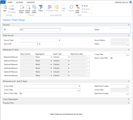
There are over 45 predefined charts that come with NAV 2013, but what if the chart you want is not available? NAV 2013 allow you to create new charts. From the Home tab, choose New and an empty chart card opens.

This screen allows you to name your chart, identify the primary source of the data for the chart (table or query), filter the data to be charted, identify the Y and X axes, and define the chart type. Chart types include; Column, Point, Line, Column Stacked, Area, Area Stacked, Stepline, Pie, Doughnut, Range, Radar, and Funnel.
An example of how the filter might be used would be a Chart on past due invoices. You could use the customer ledger entry as the source type and then filter on those ledger entries that are still open and have a due date prior to today. I would select Remaining Amount for the Y Axis and Customer Number for the X Axis. This chart would then show me all the invoices past due by customer. I could also display the chart using a different X Axis; for example, the chart could show how past due the invoices are currently.

Once the new chart has been defined and saved, it can be added to anyone Role Tailored Screen.
For additional tips and tricks regarding Microsoft Dynamics NAV and other Dynamics products, visit our blog.


