Microsoft Dynamics NAV has many pages with list views: Customers, Items, Vendors, Sales Orders and Purchase Orders, to name a few. However, it can be useful to have a quick visualization of some important business metrics without having to filter the list data. Today, you’ll see how to successfully change a list view to a chart view and how to customize a chart.
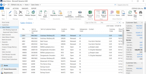
For our example, we’ll deal with Sales Orders, which are seen in the list view below. First, click on Show as Chart in the ribbon to replace the list view with the chart view.
You’ll find that no chart is displayed, however, and this is where many users get discouraged. So what’s going on here? You first need to pick out the metrics you want to see in the chart. Start by selecting an Amount found in the upper left-hand corner of the chart space. The drop-down menu will show all available choices.
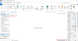
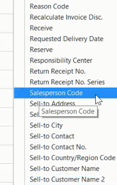
Then pick out a Dimension value from the lower right-hand corner. There are many options so make sure to scroll through the entire list.
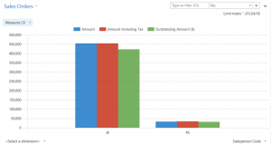
The example below shows the Amount of Sales Orders by Sales Person. As long as you leave in the Amount and Dimension, you can toggle between the list view and chart view, and the chart will stay in place. Simple, right?
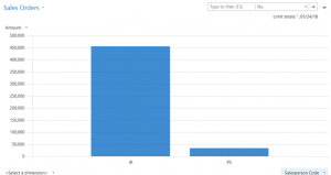
You can also add multiple Amounts to the chart by choosing more than one metric from the drop-down menu, as shown below:
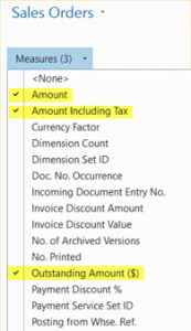
Now the chart includes Amounts Including Tax and Outstanding Amounts.
Now you know how to create a customized chart in Dynamics NAV. Next time we’ll dive into three-dimensional charts.


