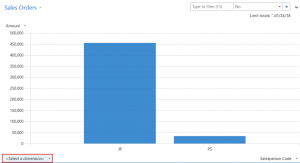
Last week’s blog on Creating Advanced Charts in Dynamics NAV dealt with two-dimensional charts, but you can also add a third dimension. Select one Amount and one Dimension from the lower right as before. Then select another Dimension from the lower left-hand corner.
Here we have a chart that shows Sales Order Amount by Salesperson and State:
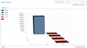
If you left click on the chart, you can move the chart’s angle to change the view to your liking.
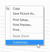
If you want to print this chart or save it to imbed in a document, right click on the chart and the Print and Save Picture As options will appear. To save the chart in Dynamics NAV, select Customize.
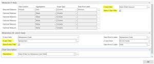
This brings you to the Generic Chart Customization where you can add an Axis Title and a chart Description. Then click on Copy Chart in the ribbon to save.
Fill in a New Chart ID and Title.
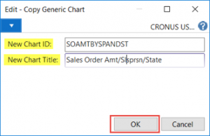
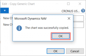
To see where the chart is now saved, go to Departments > Administration > Application > Setup > RoleTailored Client > Generic Charts, or do a “Ctrl + F3” search for Generic Charts.
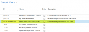
Now, if you want to insert this chart on a FactBox or Role Center, the chart will be available in the list. Read my blog on Adding Charts to Role Centers and List Pages in Microsoft Dynamics NAV for details on that process.
Customizing a Generic Chart in Dynamics NAV
You can also create a chart from scratch. Go to Generic Charts and select New on the ribbon to be taken through the customization.
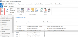
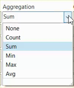
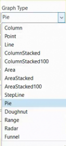
The Generic Chart Customization has many options in which to create charts that track your important business metrics. For instance, take look at the following choices for Aggregation and Graph Type to get a feel for what’s available:
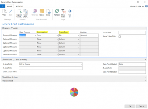
You can also select multiple measurements in the Data Column, as you can see here:
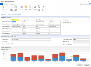
Overall, there are multitudes of available combinations in which to experiment. Hopefully, this information gives you confidence to begin creating charts and provides a foundation to build more complex charts in the future. Happy charting!


